PROJECT: Dog Food responsive website
ROLE: UX design & research DURATION: July 2022
Challenges
1. Create an website that allows users to purchase and track their dog food subscriptions.
2. Make the website responsive to various screen sizes that consumers will use.
Understanding the user
I conducted interviews and created empathy maps to understand the users I’m designing for and their needs. A primary user group identified through research were dog owners with busy schedules who struggled to get the large bags of dog food from the store to home.
This user group confirmed initial assumptions, but research also revealed that when shopping for online dog food to be delivered, a re-occurring order, or subscription was desired instead of having to order every month. The user group also wanted to be able to track the delivery.
Starting the design
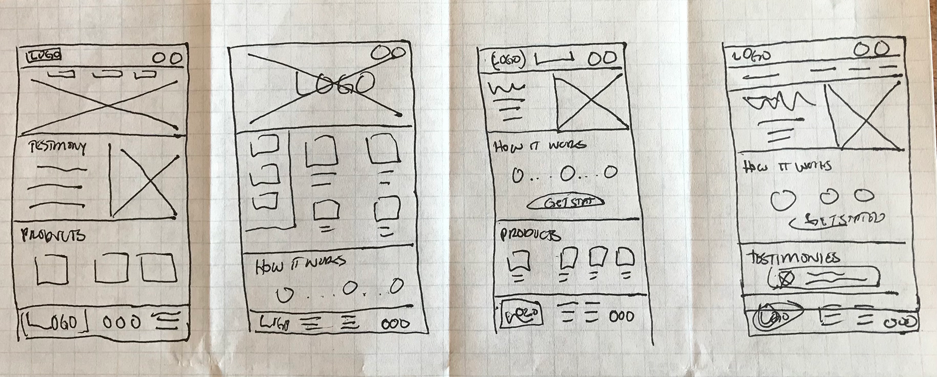
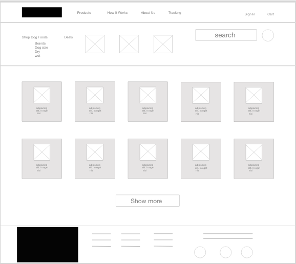
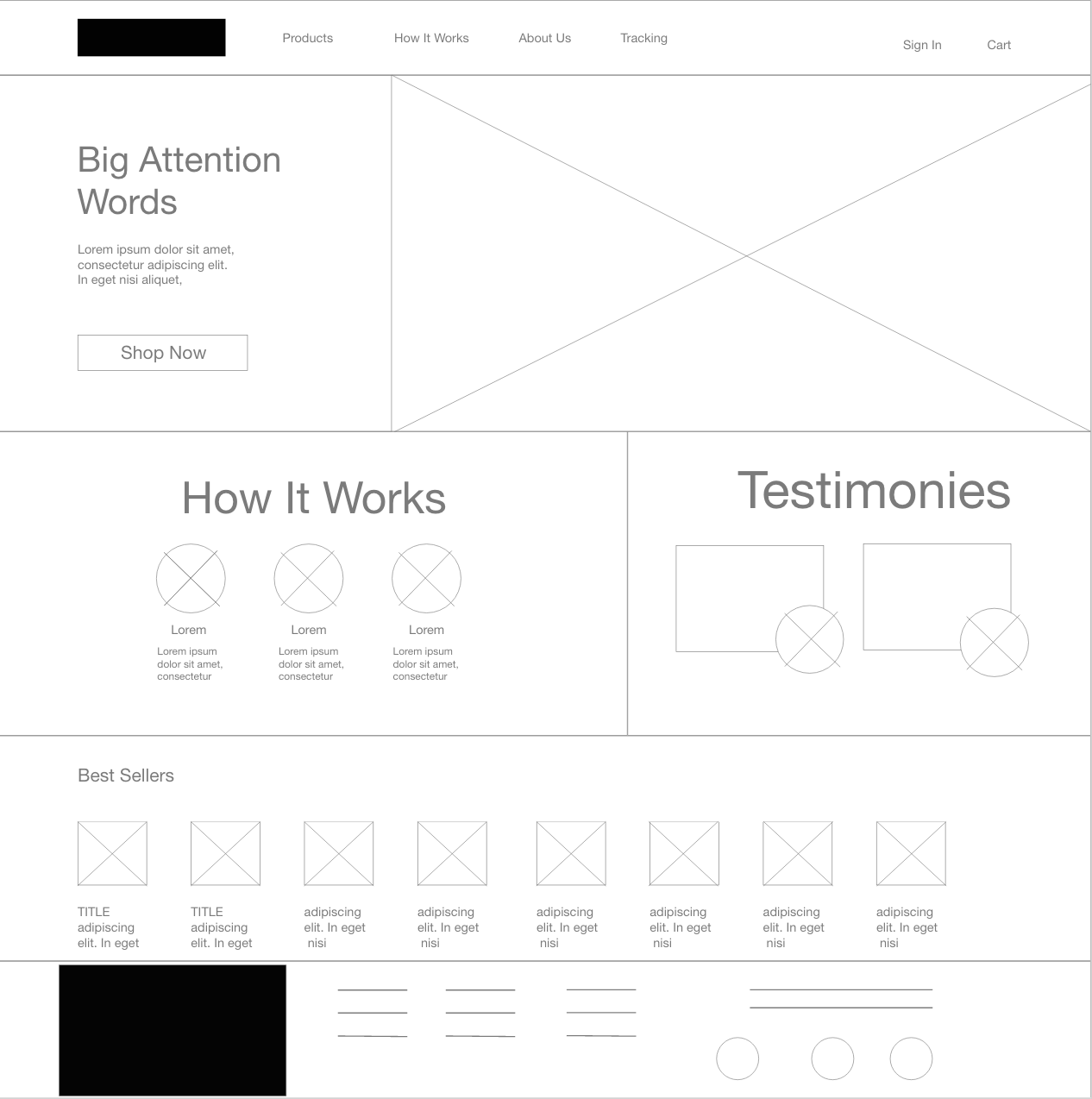
Pen and paper wire frames became lo-fi prototypes with Adobe XD and the first round of usability study was completed. Using the completed set of digital wire frames, I created a low-fidelity prototype. The primary user flow allows the user to purchase a dog food and track it's delivery, so the prototype could be used in a usability study.
I conducted two rounds of usability studies. Findings from the first study helped guide the designs from wire frames to mock-ups. The second study used a high-fidelity prototype and revealed what aspects of the mock-ups needed refining.

Solution 1
During the usability study users were asking for a way to to make monthly, scheduled, orders. The subscription page was added.
Solution 2
I included considerations for additional screen sizes in my mock-ups based on earlier wire frames. Because users shop from a variety of devices, it was important to optimize the browsing experience for smartphones so users have the smoothest experience possible.
Hi-Fi Prototype
After two rounds of usability studies and updates made to the user flow that allowed for subscription and easier to find brand names the high fidelity prototype was completed with AdobeXD, you can view it here.
Takeaway
In designing the Dog food responsive website I wanted to design something user-focused that would be responsive depending on the screen the user was using. The benefits of usability studies, audits and insights helped to develop a better product. And I learned that even a small design change can have a huge impact on the user experience.


